Project: Exceed
A first person, speedrunning experience
Trailer
Summary
A stylish assassin in training, you’re sent to a gorgeous archipelago in the mediterranean sea. Shoot and slice your way through to the finish line in speed & style, all while setting the perfect score.
The focus of the project is on game & level design primarily, with a secondary focus on scripting and visual feedback.
Noteworthy scripts:
Player controller
Camera oriented dash
Devil May Cry Inspired Style Meter
Randomizing of contextual widgets
Project Breakdown
Solo - 5 weeks, halftime (4 hours/day)
Created in Unreal Engine 5
All scripts are created by me
Goals
To create a fast and addictive speedrunning experience
To create a level that puts the player in a flow state through clever enemy placement and consistent use of metrics
Incentivizing replayability through skill expression and mastery of the level
Assets Used
Software used
Unreal Engine 5.6
Miro

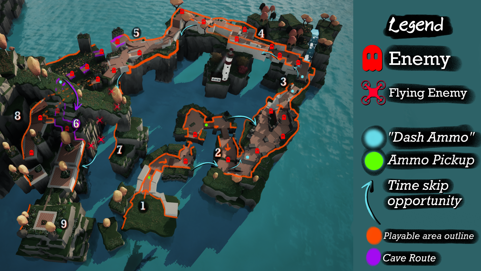
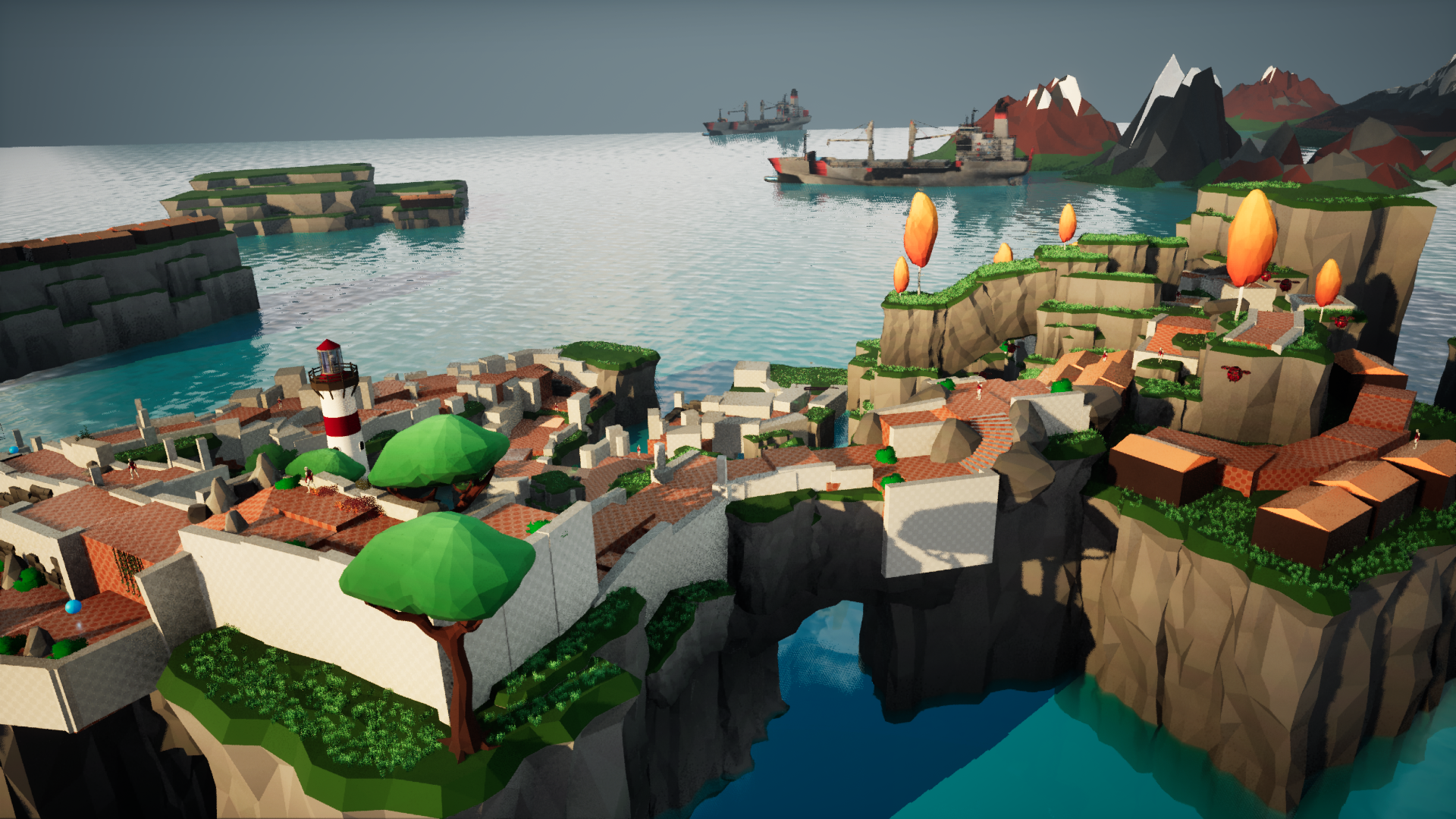
lEVEL OVERVIEW
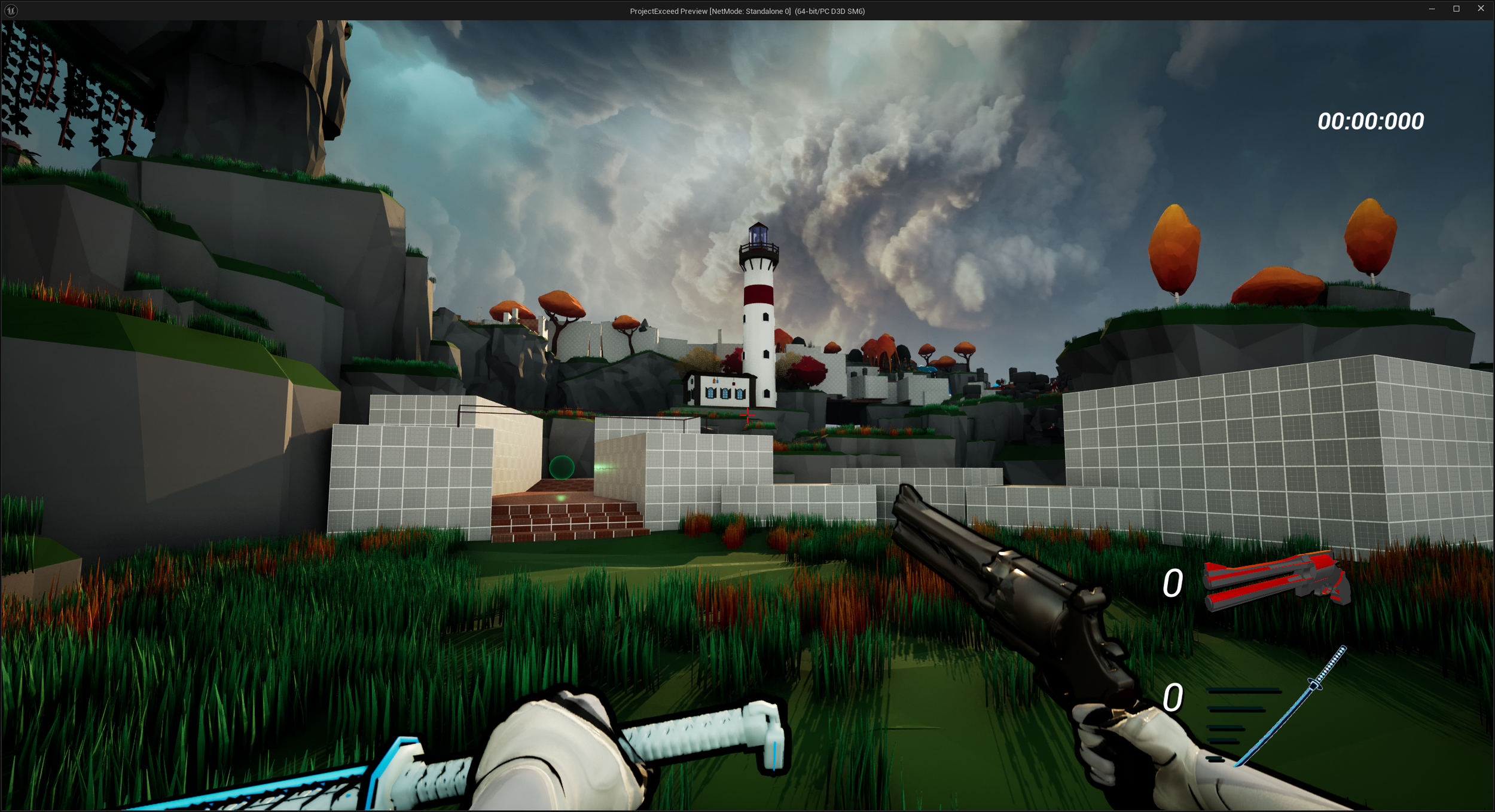
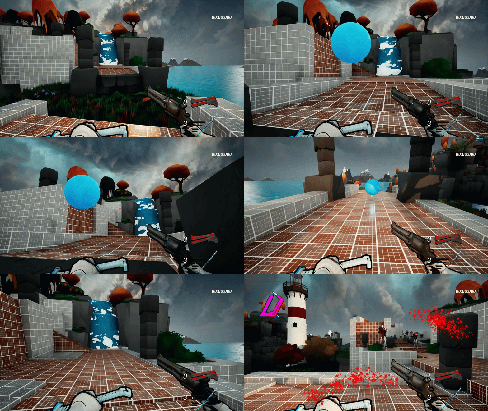
1
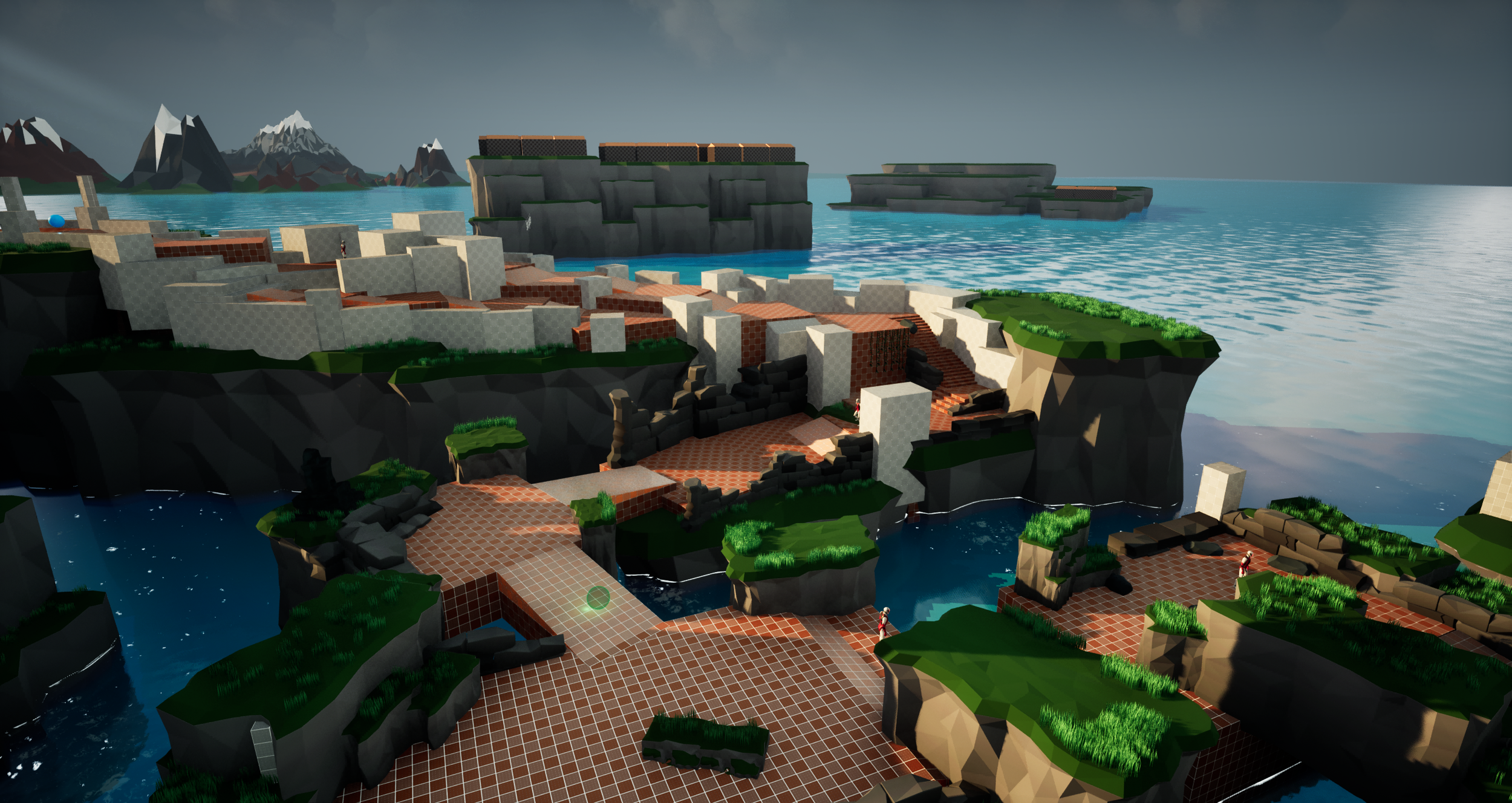
First thing that the player sees in the level. I wanted to present a somewhat dramatic composition with the skybox and the lighthouse, with the proper "entrance” to the level being neatly placed in the bottom left in rule of thirds.
Level Start
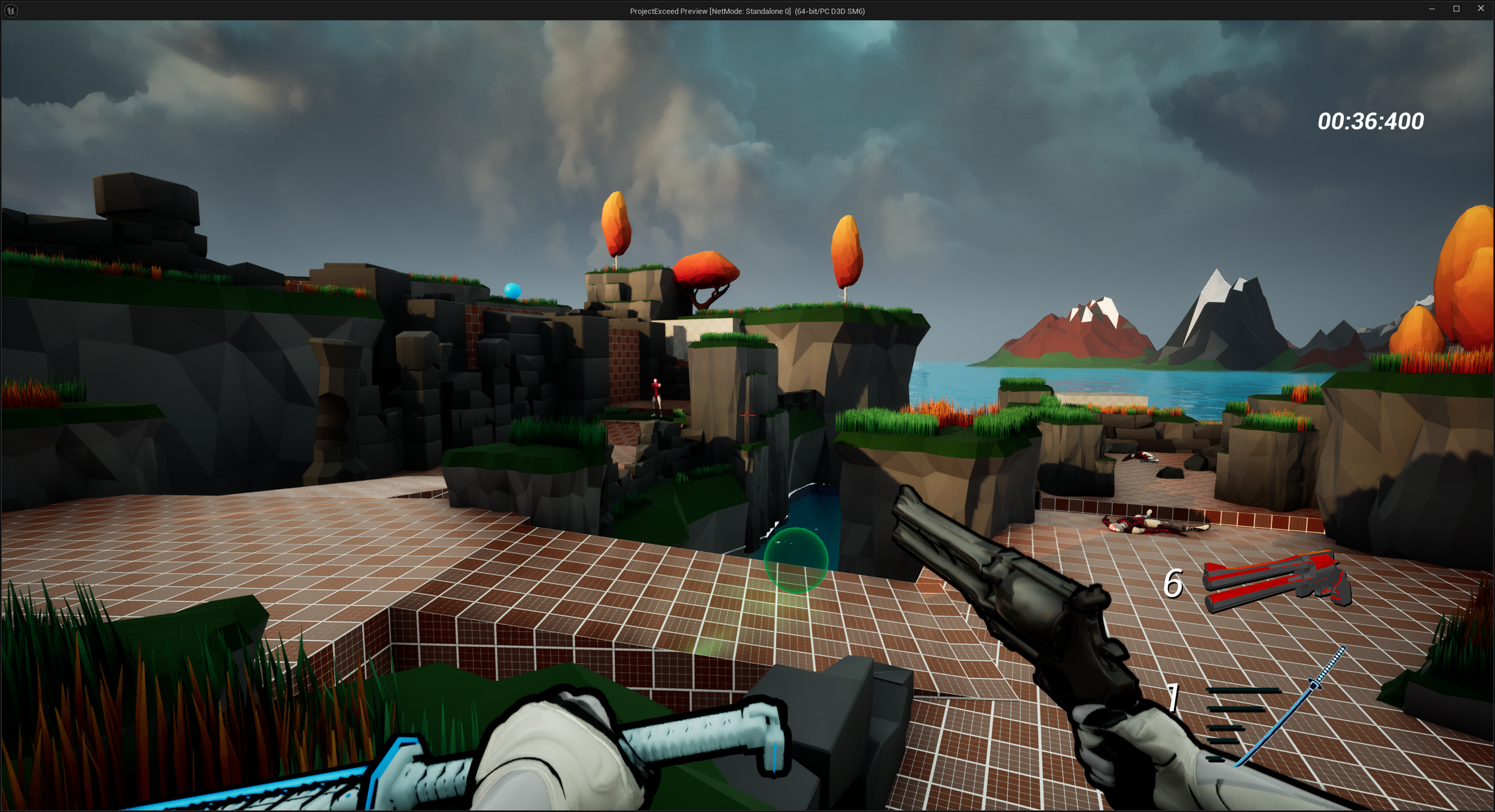
2
More or less the very middle point of Split 1. It’s a tricky area to showcase in just screenshots, but refer to the level overview above to get an idea of the possible skips you can do here. They aren’t super obvious, and that’s the point in order to reward the curious player who will go out of their way to find these level skips.
Split 1
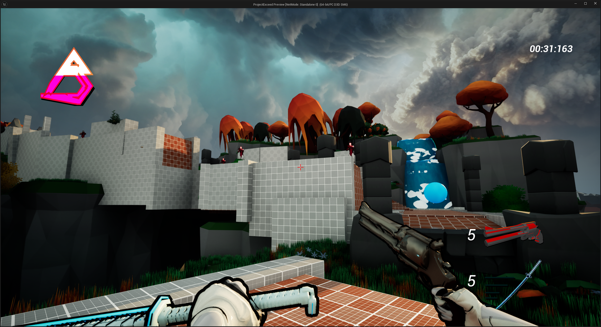
3
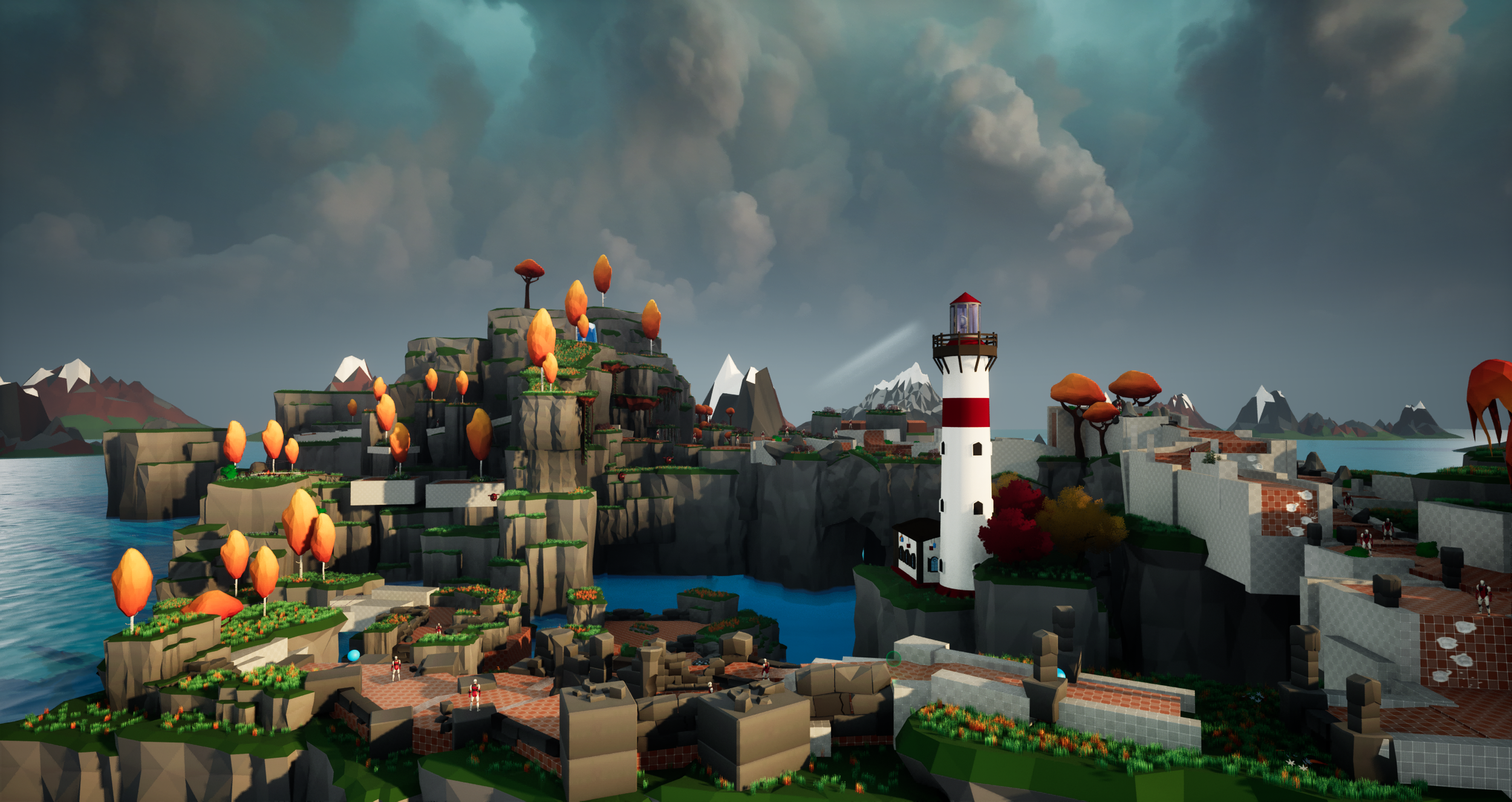
This spot is meant to showcase a big leap in verticality which acts as a milestone in the level, both visually and mechanically, as the tempo of the upcoming area is a lot more rapid than previously. The intention here is to make it feel drastically different than before, in order to make a blank mental slate for the player.
Split 2 Start
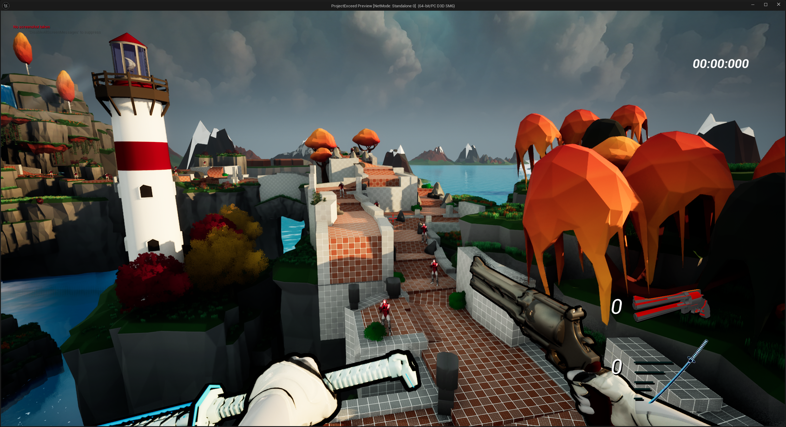
4
Split 2 is way more linear than Split 1, and that’s because it’s meant to test the players’ quick decision making and aim. I didn’t want to make it overwhelming with a bunch of new different angles where you could potentially get lost in the action, and lose a sense of direction in the level. Still, it doesn’t feel like a boring straight line to play through, due to the differences in verticality and enemy placements.
Split 2
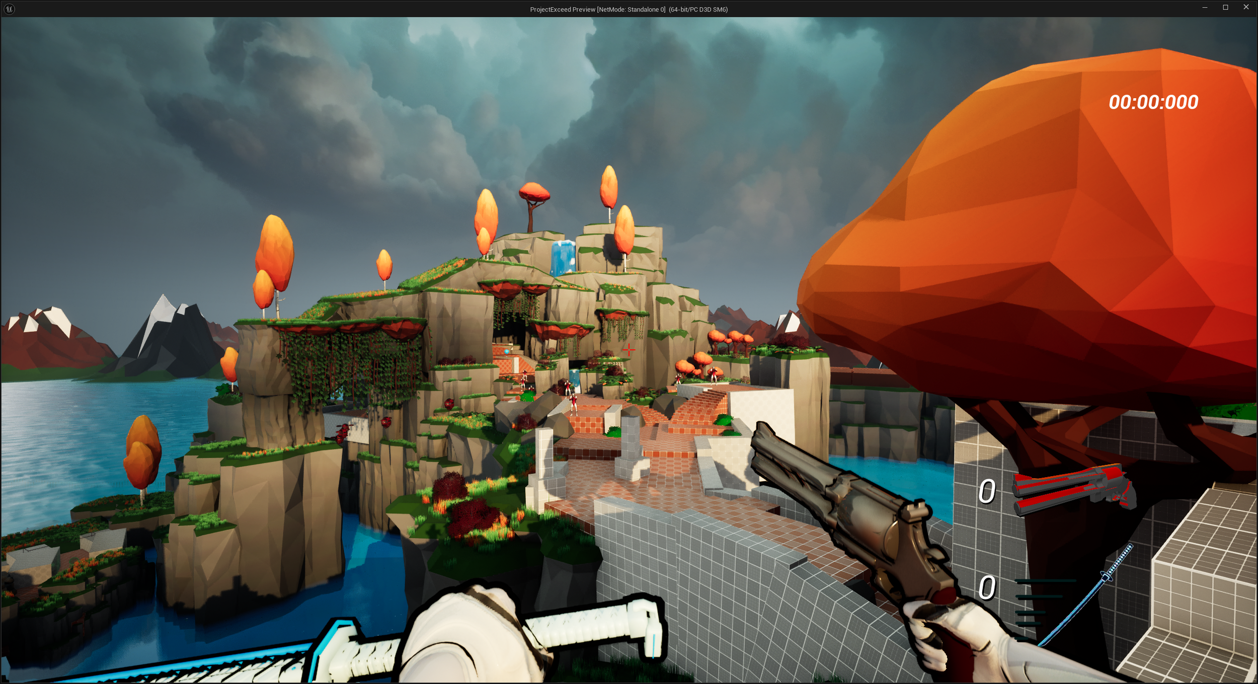
5
I wanted to diversify the elevation a lot with this split, because so far the player has only been moving upwards. To break the pace I decided to make a grander view for the player to plan out where to move, as this vantage point presents 3 potential routes which all lead to the end of the level.
Split 3 Start
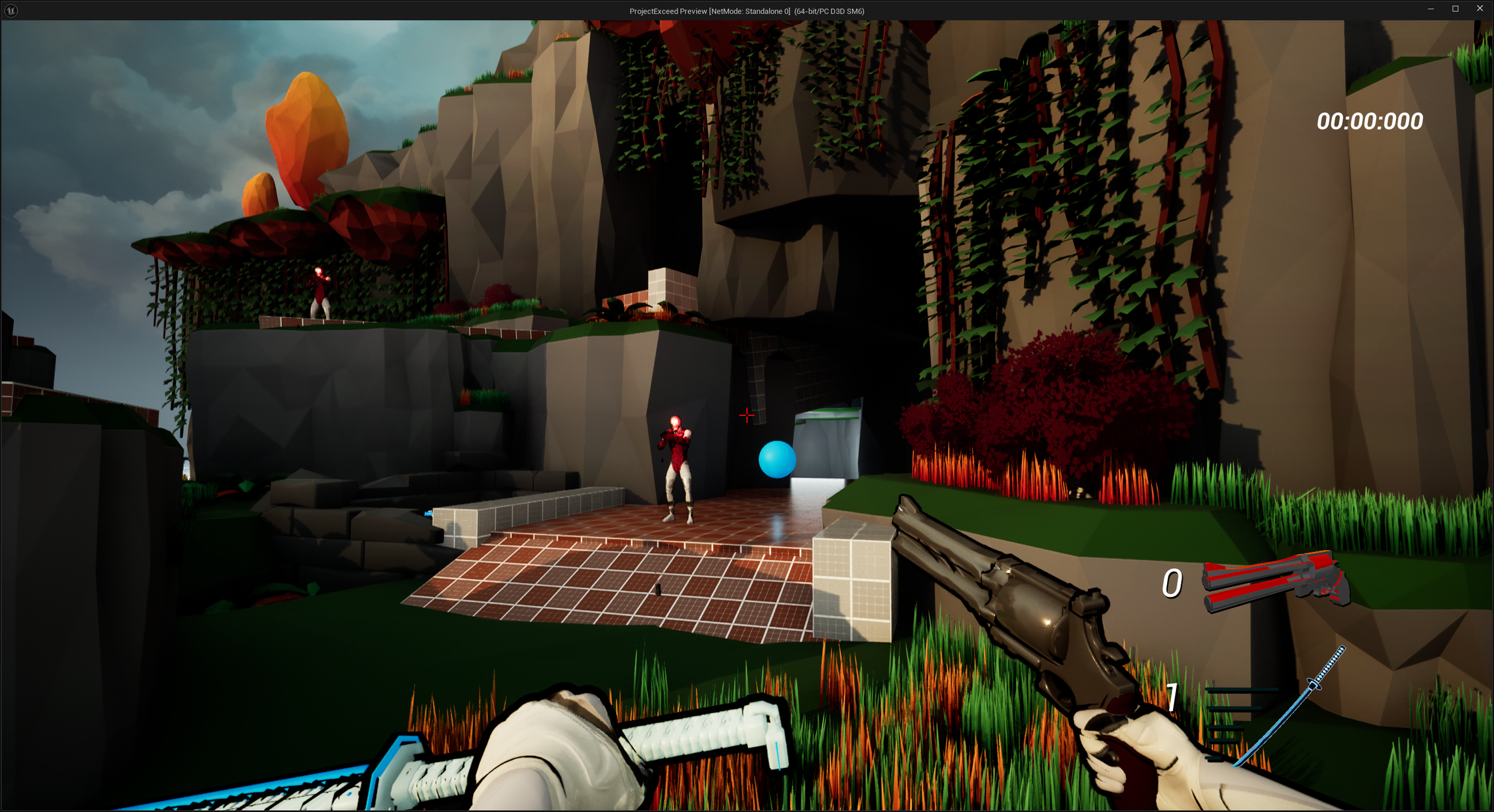
6
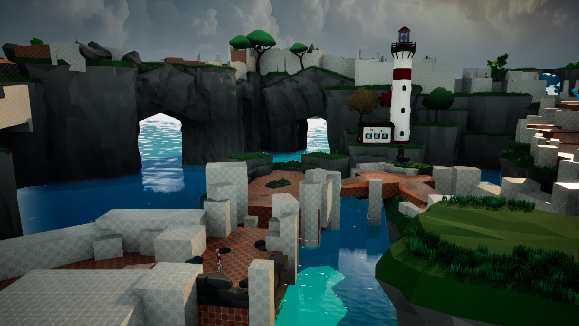
I wanted to keep indoors areas to a minimum, but making a smaller cave section in an otherwise open level, which also features a mountain, felt very fitting. The cave is more of a test in how deliberate the player is with their movement, if they spam the dash with no thought, they will probably just bump into the walls. But for those who are deliberate with their inputs, they will find themselves in a short section which rewards that patience.
Cave route
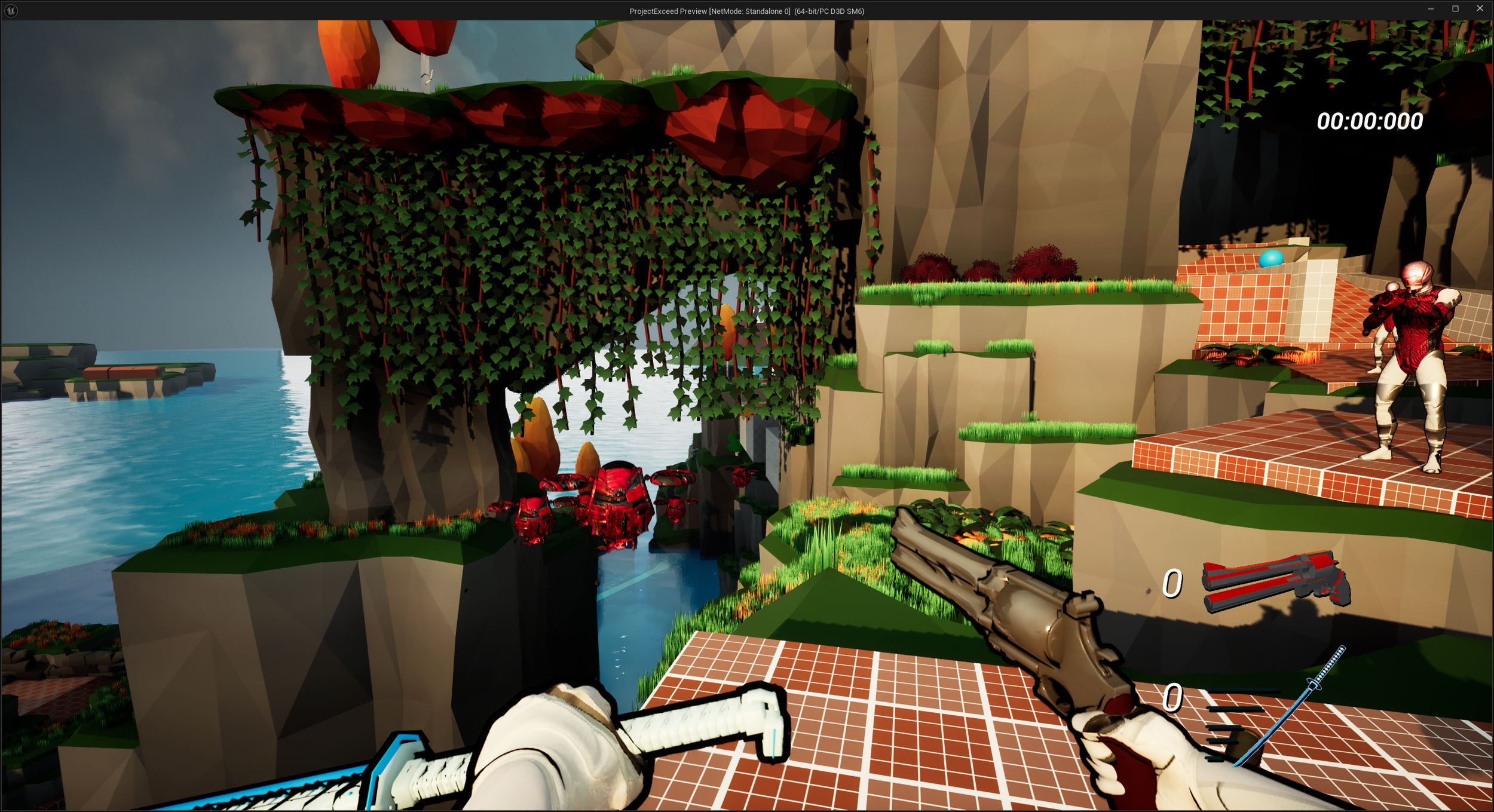
7
This route was primarily made for gameplay diversity and to include more than just one enemy type. It’s a lot less mechanically demanding than the other two routes, and as a trade off it is usually slower to take this route compared to the other two.
Flying enemy Route
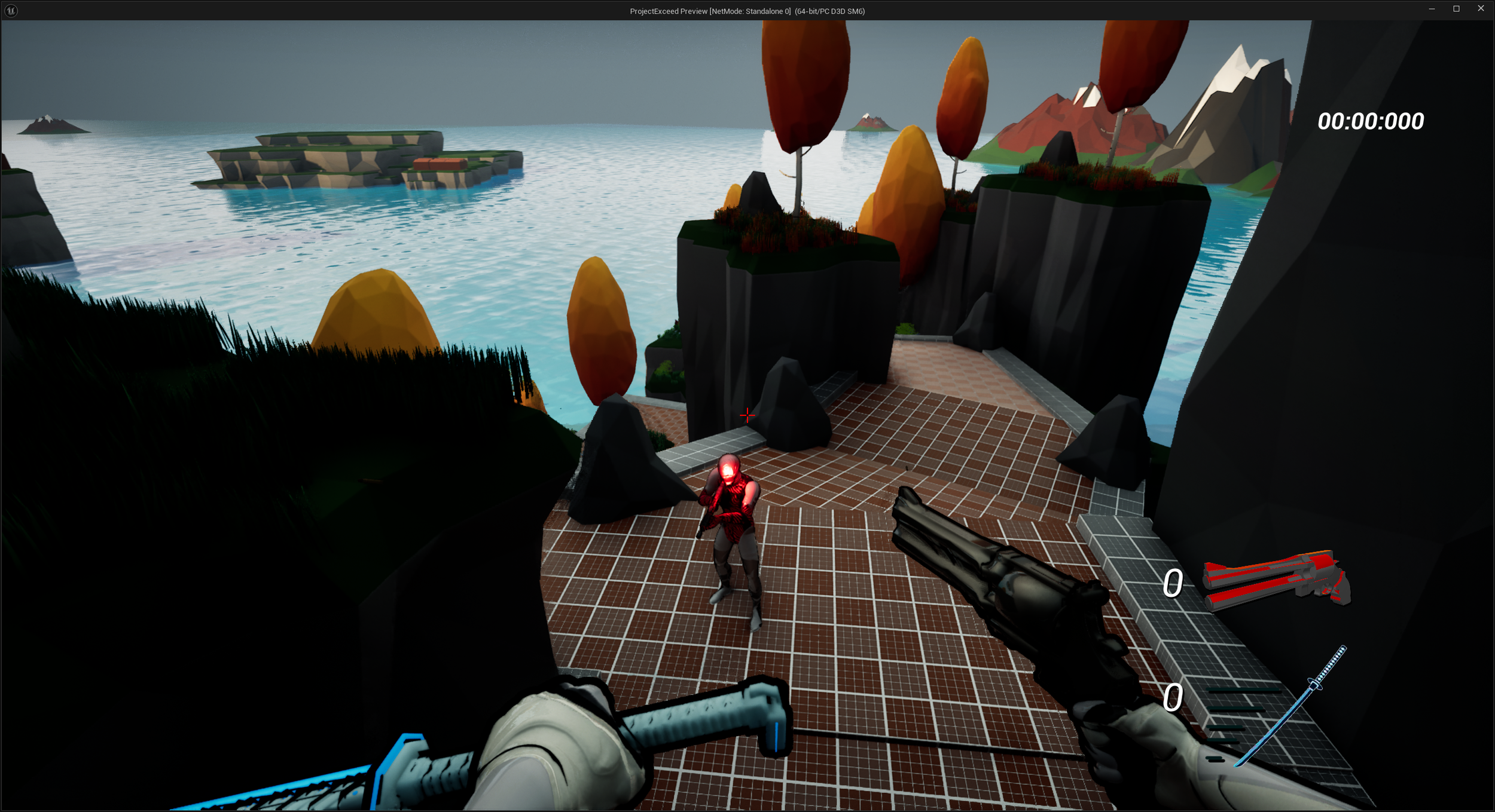
8
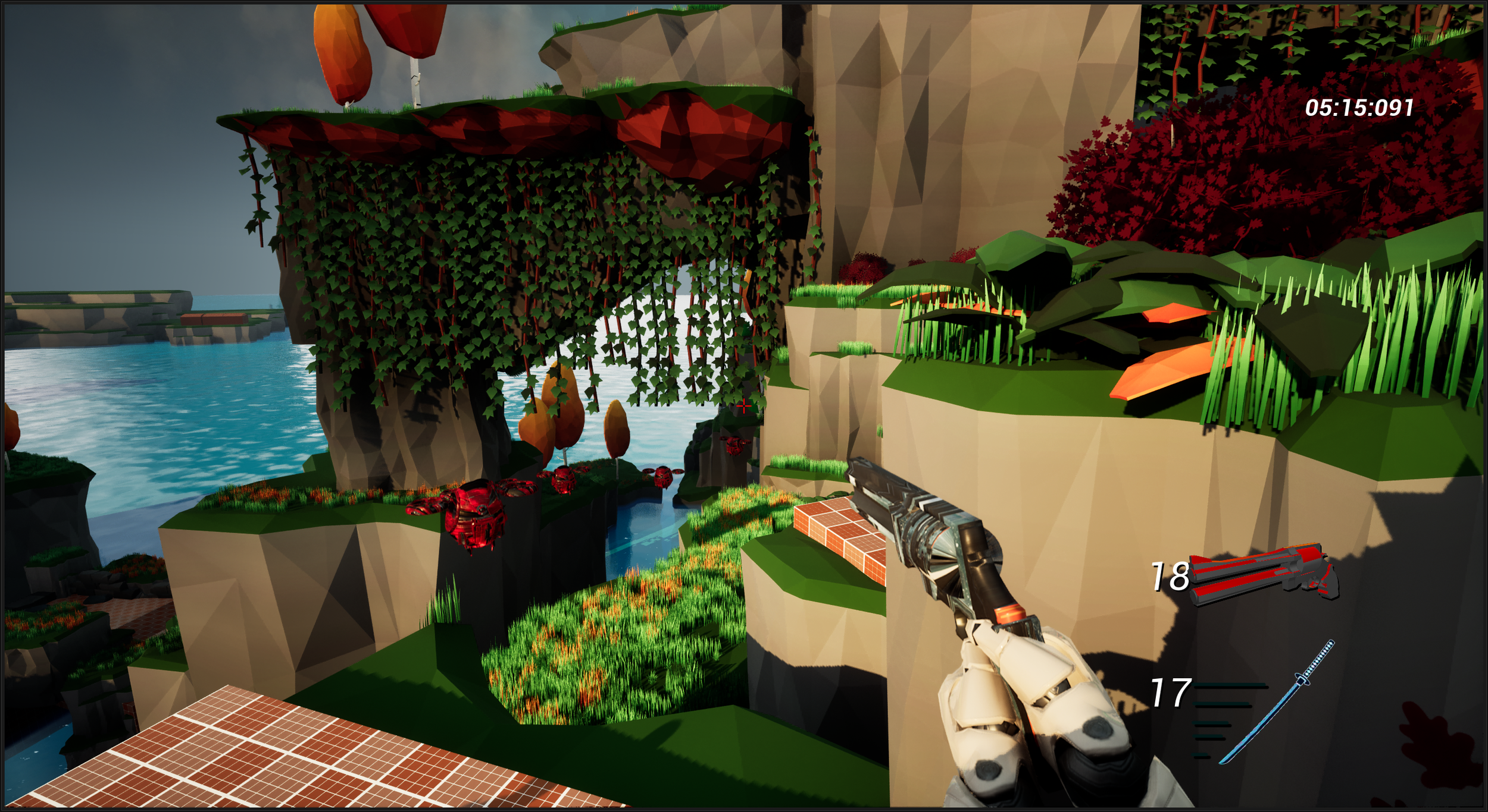
Perhaps the most lucrative route in terms of pure composition technique, the mountain route is the highest point of the map. I wanted to give the player the feeling of constantly ascending. During playtests, some found it fun to always go upwards, as it gave a sense of progression. Others found it less interesting to only go up, but I think I landed a good sense of compromise with the triple route structure, and it allows players to follow the path that they think suits them the best.
Mountain Arch Route

9
You made it to the end of the level! This small plateau serves as a pretty view as you wait for the end screen to popup.
End
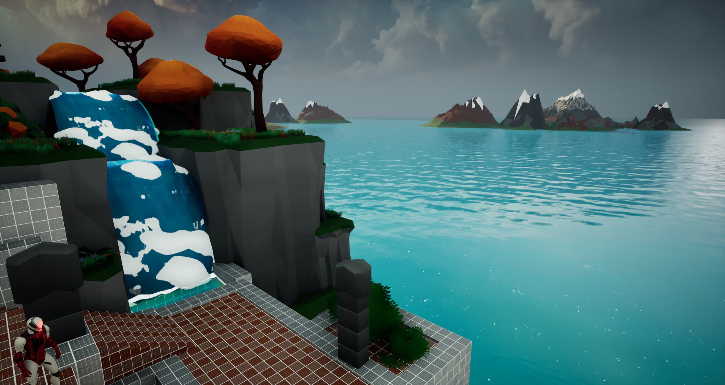
Level design
To pace a speedrunner
Video where I talk about design choices in an early stage of the level
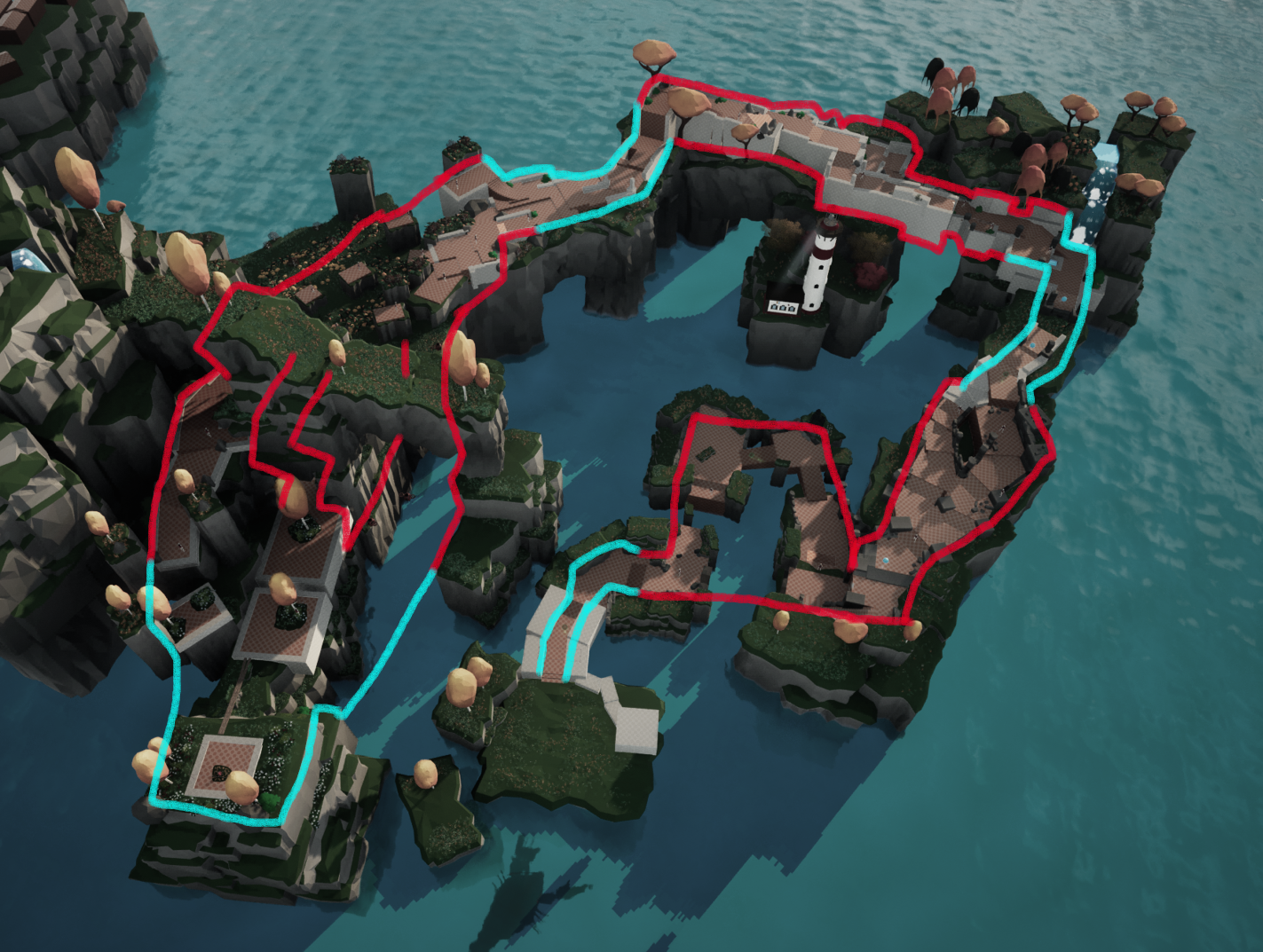
Pacing overview
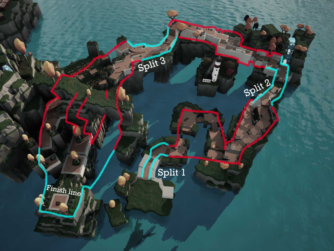

But it can get tiresome if overdone. Letting the player think and breathe in between the action is crucial to ensure they don’t burnout on the experience. The map is deliberately designed for bursts of fun with appropriate decompression zones.
I designed the map with a“3 Split” mentality;what I mean by that is I wanted to make each part of the map distinct in gameplay, and to some extent visuals.
Split 1 is somewhat of a puzzle area, figuring out where to skip to save time. It’s less about mechanical prowess and more about analytical skills on the fly. Most of split 1 serves as a combat area, but I don’t think the tempo is too high, as it is supposed to be an introductory level of the game, and as such it lets you get somewhat used to the movement, jump height and dash distance.
Split 2 is the opposite of 1, enemy placements are more dense and quick decisions paired with mechanical skill will determine how fast the player goes through this area. This area also has some baked in tutorial moments (refer to the GIF on the left) that teaches the player to be okay with using the dash for traversal, and not be afraid to “waste it” on not racking up kills with it.
Split 3 aims to combine both philosophies of 1 and 2. It’s structured in a way where you could make a split second decision that you aren’t happy with in the moment, but if skilled enough, you could easily make up the time loss. It’s higher tempo than Split 1 but slower than Split 2, which I think is important for the tension balancing of the level.
What I mean by that is Split 3 is supposed to make you FEEL like the level is close to an end, whereas Split 2 is the climax in terms of tempo as well as how mechanically demanding it is from the player.
Going fast is fun
Gap in split 2 which should teach the player about affordances in what they can’t jump up, and instead should use the dash to get across.
Game mechanics
I wanted to make a super digestable and easy-to-understand toolkit for the player, that would feel like a natural fit to the level.
The 2 core mechanics are the handgun and the sword-dash. The ultimate goal is to have a game where they both work in tandem, and complement each other for a fast and fluid gameplay experience.
The dash is set up so that the player will go in the direction of which the camera is facing, I.E. you want to go up diagonally, you look up diagonally. It makes it feel very consistent and doesn’t make it feel as if you went the unintended way, sort of how a directional input system could potentially do.
The gun works as you would expect, it fires a bullet and kills enemies in one shot, which in turn gives the player one charge of their dash.
On the other end, killing an enemy with the dash returns one dash charge as well as one bullet. I think it’s a good incentive for the player to alternate attack type for the sake of resource management. Managing your gun and dash “ammo” turned out to be a fun learning curve, and added some depth for the most optimized speedruns. If played well and no shots are missed, you can theoretically have infinite resources which I think is a fine reward for those who have mastered the toolbox.
It’s designed this way to make the player feel a lot more self sufficient, and it adds a layer of what the player needs to keep in mind during gameplay. Also, the alternative to not having this type of resource management would be to litter the level with ammo & dash pickup orbs.
I think it makes the level ugly with too many pickups, it becomes too much for the designer to balance each orb placement for different skill levels, and it makes each run more predictable in terms of how many resources you have available. Most important of all, it conflicts with one of my goals to incentivize replayability and enforce a layer of mastery since it removes that layer of resource management that I think is important to have in a game like this.
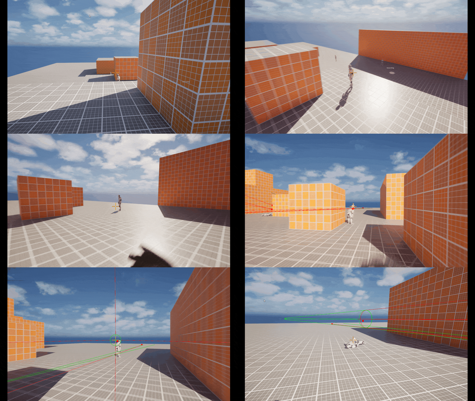
Super early prototype of core mechanics
Dash & handgun
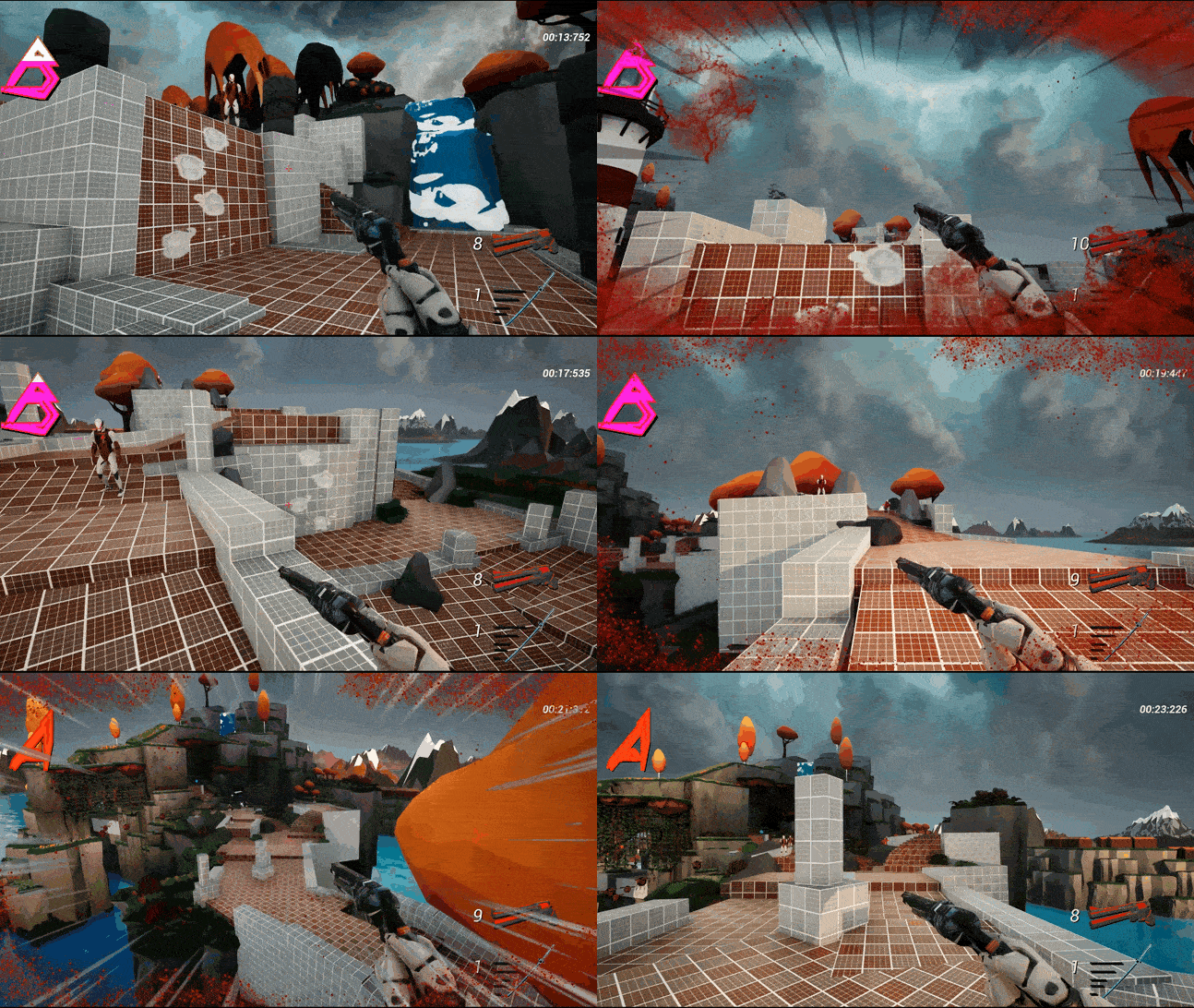
Later state
Gameplay systems
Besides the player mechanics available, there is the style meter as well as map timer.
The style meter is a visual representation of the player’s score, but done in a more “cool” way than simple numbers. I’m a big fan of Devil May Cry, and implementing the mechanic felt like a natural fit into a speedrunning game.
The timer works as expected, you trigger it at the start of the level and it stops at the end of the level!
Those two systems are in place to incentivize replayability in the level. It can make the player think “Oh I only got a B rank and sub-par timing?” and they want to have another go at the level. That thesis proved effective during my playtests, and also adds some nice visual flair to the game!
On the topic of visual flair, I worked a lot with visual feedbacking throughout the project. I think it was needed for game feel and to reach one of the goals to make it feel fast and in turn make it addicting. It’s a huge difference from the early prototype GIF to the trailer footage and I’m very pleased with how it turned out.
Video where I go over the mechanics
Early ideas
The name for the project, “Exceed”, actually came from a Devil May Cry mechanic where one of the protagonists can rev his sword like a motorcycle, and when fully charged would unleash a devastating attack.
The initial idea was to create that mechanic in a first person shooter, but ultimately couldn’t be balanced or feel good in combination with the rest of the players’ toolkit. The amply named “Exceed Shot” was a one shot and would penetrate all enemies that it collided with. The normal gunshot required 3 hits for a kill, but it just felt so redundant to use when the dash was also a one hit kill.
The player could also instantly reach the required amount of Exceed Revs, if they hit the Rev input 0.1 seconds after firing.
I decided to scrap the Exceed mechanic in favor of having a better feeling revolver, as well as better gameplay tempo and a more focused player arsenal. The name sounded cool though, so I kept that :)

Scrapped “Exceed” Mechanic
Reflections
This project is absolutely my most iterative one to date. The end product is severely more focused than the initial vision, for the better. All from scrapped mechanics, to the visual style, to the level layout itself.
But if I were to create more levels for this toolbox of a project, I would make levels more memorable for a more focused experience.
What I mean by that is, have some levels that are higher tempo and demands more mechanical skill, and have others that demand more analytical skill and rewards the curiosity for finding skips in the level. I think the latter approach is very cool from a level design standpoint, but I also just found it so fun to go fast in this game that I wanted to make a level that could offer both experiences.
Working on Project: Exceed has been very humbling and very eye opening for me in terms of iterative work as well as what makes a game fun and digestible.